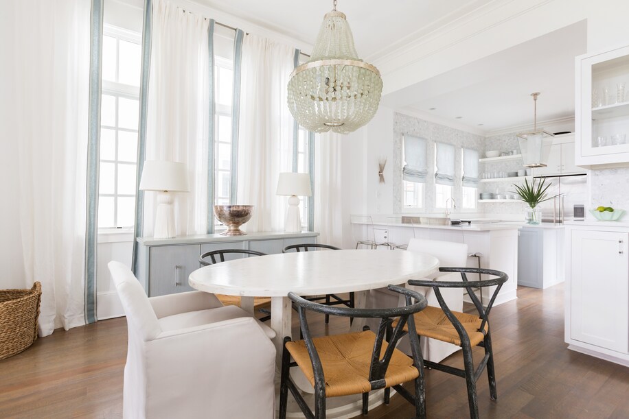
Decorator Betsey Mosby, based in Jackson, Miss., says her biggest decorating peeve is curtains that are not hung appropriately. “It’s a mistake to hang the rod right above the window molding and have the rod only extend to the edge of the windows.” Instead Mosby hangs the rod directly below the crown molding, like she did in this project. (Brittany Godbee Photography)
You can always count on a decorator to tell you what’s wrong with a room — and, typically, said decorator will not take a breath before telling you how to fix it. “There is just so much that is obvious to us, but not to others,” says the District’s Zoe Feldman.
But most of us don’t have professional decorators stopping by regularly to tell us what faux pas we’ve made, so we asked eight for their top design pet peeves. Here’s what they said.
Art that’s hung too high or too low: To find the right height to hang art, New York designer Celerie Kemble says to pretend the piece of art is a mirror and see where you’d want your face to be in the reflection. “Your art should be looking at you in the eye like someone who would be shaking your hand,” Kemble said.
Colored matting: “Never pick out a color from a piece of art to use for the matting color; it’s distracting. Matting should be neutral and just disappear,” Feldman says. “Art looks best framed against a shade of white.”

“Don’t push all of the furniture up against the walls. Your living room should feel inviting and should be conducive to conversation. It’s not a middle school dance!” says designer Paloma Contreras, who suggests floating at least one substantial piece in the room, like she did in this living room. (Kerry Kirk)
Badly hung curtains: Decorator Betsey Mosby, based in Jackson, Miss., says her biggest decorating peeve is curtains that are not hung appropriately. “It’s a mistake to hang the rod right above the window molding and have the rod only extend to the edge of the windows.” Instead Mosby hangs the rod directly below the crown molding (unless the room has unusually tall ceilings, in which case she raises the rod a couple of feet above the window). “I also extend the rod past the windows horizontally so that when the curtain is open and stacked, it is not overlapping the window.” The overall treatment makes the window seem larger. Feldman also hates curtains that are too short or too puddled on the floor. “I like my curtains to fall like nicely tailored pants,” breaking a half-inch onto the floor.
Unlined curtains: Mosby says they are “the worst.” “There are very few occasions that call for no lining on window treatments. Lining gives the appropriate weight and feel to your curtains.”
Too-small rugs: For Dallas designer Jean Liu, walking into a room and seeing all the furniture crammed onto an area rug that’s too small is her No. 1 pet peeve. “I recommend getting rugs that are appropriately scaled for each room.” She says to leave six to 12 inches of floor showing around the perimeter of the rug. “It’s a balance between wanting to see enough of the floor, especially if it’s a nice species of hardwood, knowing if there are floor vents and either avoiding or cutting around them, and determining if your rug will need to involve seams, and if so, where they should be placed.”
Houston-based decorator Paloma Contreras concurs. “There are few design crimes as bad as having a little postage stamp for a rug in the center of your room.” Contreras says to always opt for the largest rug your room can accommodate. “You’ll want to makes sure that at least two of the legs on each piece of furniture are on the rug, but optimally, every piece will sit completely on top of the rug, except for the dining room, where all of the legs must be on top of the rug with at least three inches beyond the edge of the dining table.”
Rugs layered on carpet: For Jeffry Weisman of San Francisco’s design firm Fisher Weisman Brugioni, area rugs layered on top of wall-to-wall carpeting is a major pet peeve. “We hate it, but sometimes you have to do it. In that case, we use sisal wall-to-wall, which reads more like hardwood floor than carpet, and then we float the area rugs on top.”
Poor furniture placement: Kemble dislikes when furniture is set up so that everyone is facing one direction (usually toward a screen). “Living rooms should be set up for conversation. Place the chairs and sofa in relation to one another as if they were friends at a party and were chatting.”
Contreras warns: “Don’t push all of the furniture up against the walls. Your living room should feel inviting and should be conducive to conversation. It’s not a middle school dance!” She says to “float” at least one substantial piece in the room.
Uninspired furniture shapes: New York stylist and designer Olga Naiman dislikes when everything is square or rectangular in a room. “It’s becomes one-dimensional and uninteresting. You need to mix it up by adding circular or amorphous shapes.”
Bad lighting: Bad interior lighting bothers Tatyana Miron Ahlers, a partner in the New York design firm Pappas Miron, the most. “Lighting in any room makes all the difference, but when entertaining, low and even light is crucial.” She says to avoid compact fluorescent lights at all costs and instead buy LED bulbs that have the “warmest” temperature, usually 2700K. She also suggests stocking up on 60-watt incandescent bulbs, which are being phased out, to use at dinner parties or holidays.
Visible cords: Kemble hates it when people miss simple chances to hide electrical cords. She says to tape them under tables or use twist-ties to conceal them.
Cottage cheese ceilings: Weisman (and just about every other designer in the world) dislikes those outdated textured ceilings he calls “cottage cheese ceilings,” though you may know them as popcorn ceilings. Use quarter-inch Sheetrock to cover it, which he says is more cost-effective than scraping. “Also, we have been told that the old acoustical coating sometimes contains asbestos, in which case it’s safer to bury it than scrape it.”
Sad, flat pillows that came with the couch: Feldman doesn’t like throw pillows that aren’t full enough. She advised to always go up a size with inserts, so if you have an 18-by-18-inch pillowcase. you should get a 20-by-20 insert. And Mosby says to replace any throw pillows that come with your sofa. “You should always customize them to one or two different patterns to add interest, texture and scale.”


